Redesigning InfoMoney’s Homepage
Company:
InfoMoney
Year:
2024
Role:
Product designer (UI/UX, Information Architecture)
Team:
Me and another mid-level designer, PM, Tech lead

About the company
The biggest and the best portal for financial news in Brazil
_ InfoMoney is Brazil's top financial news portal, offering real-time market data and investment insights to millions of people.
_ In 2024, I led the redesign of its homepage to empower editorial teams, boost business results, and modernize the user experience.
The challenge
InfoMoney's content was excellent, but its homepage was rigid and difficult to maintain.
Rigid, Outdated Homepage
Editors couldn’t update layouts or highlight breaking news without developer help.
Inconsistent Design
The visual elements were disorganized, which caused confusion for users and made the brand less noticeable.
Limited Flexibility
The homepage couldn’t adapt to new editorial priorities or special coverage.
Infomoney’s old homepage
How might we create a modular homepage that empowers journalists to update content independently while adapting to diverse editorial scenarios?
Key objectives
Our approach was based on clear objectives, UX principles, and product premises.
The InfoMoney Design System, developed to provide a strong framework for consistent, scalable, and efficient digital experiences, was a foundational element.
Modularity
Create a modular homepage that empowers journalists to update content independently.
Adaptability
Ensure the homepage adapts well to diverse editorial scenarios and emergency situations.
Brand Consistency
Apply the InfoMoney Design System to achieve a unified and scalable experience.
Content Recirculation
Promote seamless navigation and increase user engagement.
Business Growth
Support lead generation and ad revenue.
Credibility
Preserve and reinforce InfoMoney’s reputation as Brazil’s top financial news portal.
The process
I joined the project midway to provide clarity, structure, and validation. I drove the project forward when the team was struggling to align with stakeholders and convey the value of design.
1. Discovery & Alignment
-
Audited the existing homepage and benchmarked top news/finance sites.
-
Interviewed journalists, editors, and developers to uncover pain points and goals.
Main findings:
-
We really need the tech team to do basic updates.
-
There was a lack of distinction between breaking news and evergreen content.
-
The design is monotonous due to its fixed, repetitive structure.
2. Modular System: Building Blocks of the Homepage
We created a base content module, which is a standardized container for interchangeable content blocks. This enables flexible and reconfigurable layouts that adapt to editorial needs while maintaining visual harmony.
-
Reorderable and configurable modules (1-column, 2-column, full-width).

The basic homepage's building blocks
3. Design System Integration
We built a comprehensive library of content components (e.g., news cards, video embeds, image blocks, featured products) that adhered to the new InfoMoney Design System.
-
Applied the new InfoMoney Design System for consistency and scalability.
-
Used a responsive 12-column grid for seamless cross-device experience.

Cross-Device Responsive Homepage
Prototyping & Validation
We rigorously tested different layout options in Figma and conducted user testing with the editorial team and end-users. The modular interface was positively received for its clarity and flexibility.

User testing and validation
Impact & Results
The redesigned InfoMoney homepage significantly improved both user experience and business outcomes, with post-launch tracking revealing impressive results:
And more:
_ Editorial Autonomy: Journalists now update the homepage independently.
_ Brand Consistency:
Unified look and feel across all platforms.
_ Business Growth: Increased engagement and revenue opportunities.

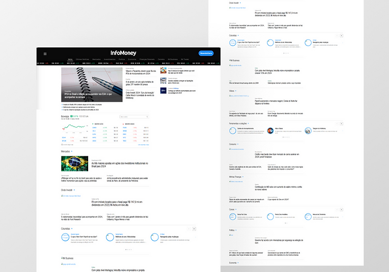
The new Infomoney homepage.